Photo by Neal Bolton
Highway engineers often use a mass diagram to balance cuts and fills along a road profile. I like to use a similar approach to monitor waste volume on a transfer station floor, but instead of tracking cuts and fills, I look at tons of waste. That is: Tons in versus tons out.
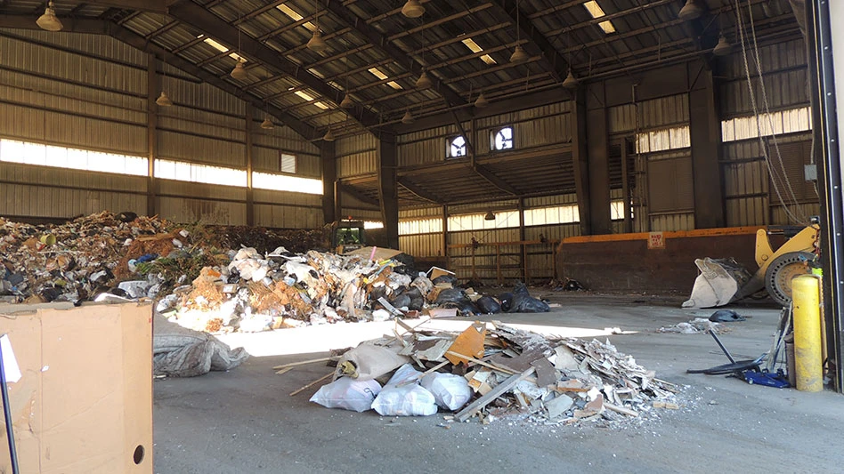
In the world of computer programming, the term “garbage in, garbage out” is a derogatory term. But if you run a transfer station, "garbage in, garbage out" is the name of the game.
A mass diagram helps us manage what happens between the in and out.
Here’s an example of a transfer station that receives approximately 500 tons during a 10-hour weekday.
Developing a mass diagram uses two different sets of data. The first is actual scale data to chart how many tons enter the facility every hour, every day, Monday through Friday, for several weeks.
If the operation sees wide swings in tonnage or timing across multiple seasons, the analysis must account for that.
The other data is the production rate associated with moving tonnage out. We can start by looking at the average hourly output—that is, daily tons hauled out, divided by daily work hours.
For example, we’ve assumed that the transfer station exports 400 tons per day while working a 10-hour shift.
By dividing tons by work hours, it appears this facility exports an average of 40 tons per hour. The key word here is average. If we plug this into the mass diagram, it will reflect the current operation, but it won’t help us improve the operation, hopefully reducing overtime.
I always look for variations in productivity—there always are some. When we find examples where outbound tonnage production was above that 40-ton-per-hour average, we must ask the question, “How did that happen?” Then we try to replicate that process to boost production throughout the day.

Chart 1 shows an hourly mass diagram that covers one day. Again, the 40-ton-per-hour output is based on the average.
But if we actually track how many tons are exported every hour, we see greater swings, typically running from zero tons during a nonproductive hour, likely due to lunches, breakdowns or other factors, to two-to-three times the normal average. With thoughtful evaluation, we usually can find a way to replicate those productive hours.
In this example, the inbound tonnage ranges from 30-60 tons per hour throughout the day, while the average outbound tonnage is set consistently at 40 tons per hour if there is waste on the floor ready to load out.
It shows that the system is not keeping up, with 100 tons of waste left on the floor at the end of the day. This will lead to some serious financial pain for a transfer station that normally operates Monday through Friday.
If the facility falls behind 100 tons per day, every day, 500 tons will remain on the floor by the end of the week. This means the transfer station will need to run its entire crew Saturday to catch up, clear the floor and prep for Monday.
The normal five-day operation just became a six-day operation. That means the regular costs just went up by 20 percent, and the labor costs increased even more due to the magic of excessive and continuous overtime.
But it gets worse. Numerous studies show that a continuous pattern of overtime has serious impacts on worker productivity and safety. During the normal Monday through Friday schedule, the transfer station staff is working 10 hours per day, or 50 hours per week. By adding another 10 (overtime) hours Saturday, the staff is up to 60 hours per week.
One of the classic studies on overtime effects shows that after 10 weeks of continuously working 60 hours per week, workers became less productive than if they worked a baseline of only 40 hours per week.
Is this loss of productivity due to physical or mental fatigue, emotional stress or just a worsening attitude that comes from individual workers feeling that they live at work? Likely it’s all the above.
If it costs more and makes workers less productive, managers should do all they can to avoid excessive, ongoing overtime. In this example, that means doing a better job of garbage in, garbage out.
A mass diagram is not the answer to boosting productivity, but it certainly can be one of the tools you use to improve your operation.
Neal Bolton is president of Blue Ridge Services Montana Inc. He has been improving solid waste operations for more than 47 years and can be reached at neal@blueridgeservices.com.
Latest from Waste Today
- New York DEC to host virtual meeting series on PFAS
- Wisconsin releases food waste evaluation report
- NWRA appoints senior VP of administration and events
- Demo Leaders launches zero-waste program
- Ecowaste acquires Baker Trash Services and Gardner Disposal
- Computer Recycling – Maryland launches Washington e-scrap pickup service
- BioTown Biogas appoints CEO
- Enviri named a Global 100 Most Sustainable Corporation